Product
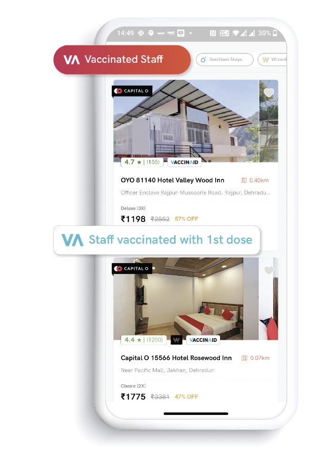
Trust signals, in the funnel. The Vaccinated Staff badge and Sanitised Stays filter, live at the moment of decision — turning the operational commitment into something a guest could verify before booking, not just at check-in.
Two pandemic-era interventions. One theme: trust, made verifiable.
Every hotel brand in the world was telling guests, in 2020, that they were being safe.
The blitz of hygiene messaging that hit the category during the pandemic was so uniform, so identical in its language and its visuals — the same sanitiser-spraying-on-doorknob b-roll, the same reassuring voiceover, the same font on the same PDF of the same cleaning protocol — that it collapsed into noise. Every brand was saying the same thing. Which meant no brand was actually saying anything.
What follows are two of the interventions I led during that stretch. Different formats. Same underlying discipline.
The first intervention wasn't just a hashtag. It was a specific operational commitment translated into a brand promise: the guest doesn't have to trust that the room was cleaned before they arrived. The final sanitisation happens in front of them, when they check in.
That single operational choice — moving the last hygiene step into the guest's line of sight — did what a hundred hygiene claims from competitors couldn't. It moved the brand from telling people it was safe to showing them.
It ran alongside a set of in-app trust signals — the Vaccinated Staff badge, sanitisation status per property, and a running counter of health protocols per booking — that made the promise legible not just at check-in, but at the point of booking.
Every brand was saying the same thing. Which meant no brand was actually saying anything.
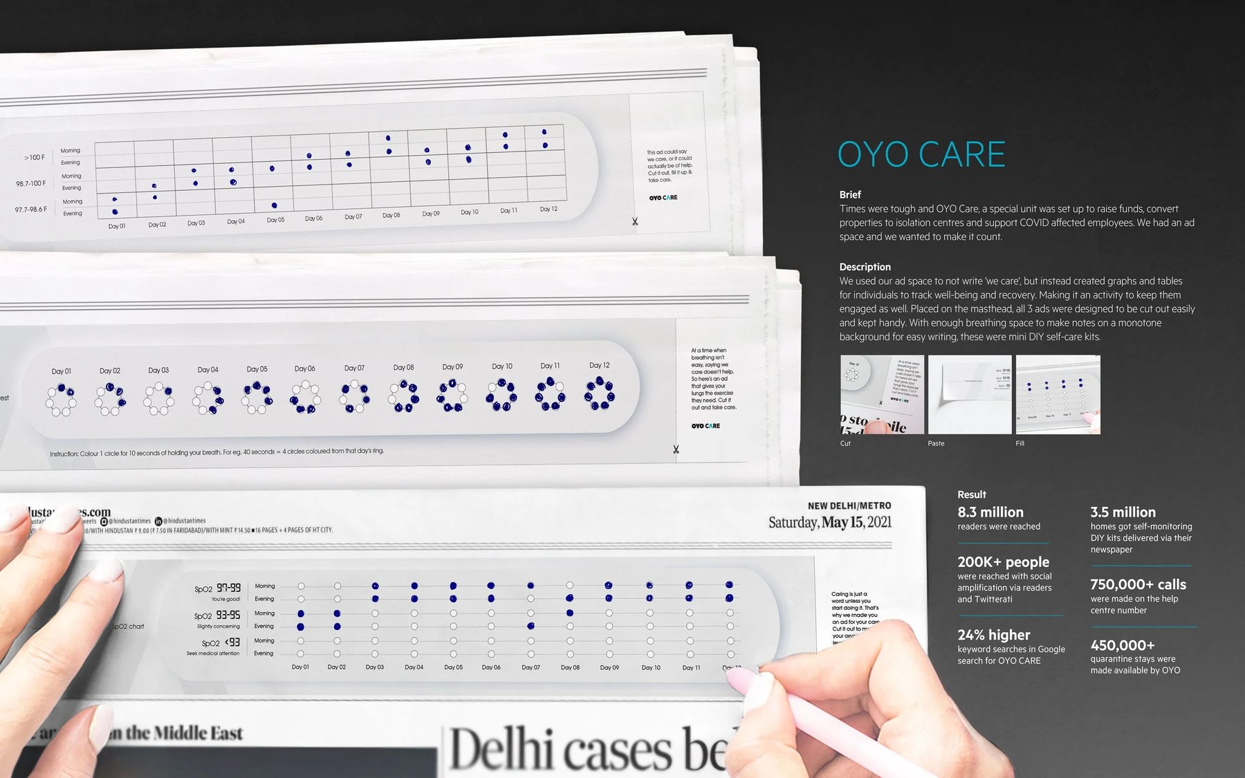
The second intervention was different in shape. As the pandemic peaked, OYO set up a dedicated unit — OYO CARE — to raise funds, convert properties into isolation centres, and support COVID-affected employees. The unit had a real cause, real spend, and a serious ad-space allocation to make the country aware of it.
The lazy version of the brief would have been to run "we care" ads across newspaper mastheads. Every brand doing pandemic outreach was running that ad, in various fonts. It was noise.
What we did instead: we treated the ad space as a physical object. Every day, three newspaper ads ran as DIY self-care kits — printed graphs and tables for tracking oxygen saturation, temperature, and breathing exercises. Cut them out, fold them up, keep them handy. Not creative writing. A physical tool the reader could use.
These two projects don't look alike. One was an in-hotel operational commitment. The other was a newspaper ad reimagined as a physical tool. What connects them is a single discipline: when a category converges on the same message, the winning move isn't to change the wording. It's to change the format.
Show it in a way the competitors can't easily copy. Make the promise operational, so the delivery is the message. And treat the ad space, wherever it lives, as an object the audience can use — not just a surface for a claim.
Both projects helped OYO's honesty of purpose stand out in a period defined by misinformation and media finger-pointing. And both changed what "hygiene comms" could be in Indian hospitality.